
Checking the time has become second nature. A flick of the wrist. A glance. Usually, it’s forgettable. With Apple’s 2025 Pride Edition, that motion becomes a point of reflection. The technology remains the same. What changes the experience is the way the design commands attention.

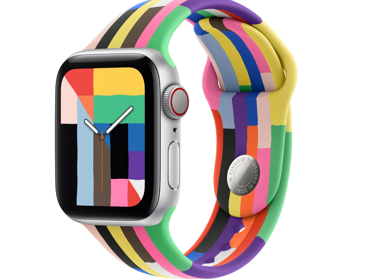
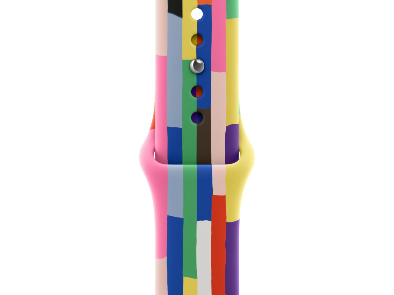
The band is built from fluoroelastomer, like Apple’s standard sport straps, while this version avoids simple dyeing or printed patterns. Each color strip is cut and laid into place, then compression-molded together. This process does not prioritize mass efficiency. It introduces variation by design. No two bands are exactly alike. Some show wider arcs of purple. Others press more green or orange to the surface. That randomness creates a subtle individuality, even within a structured production process.
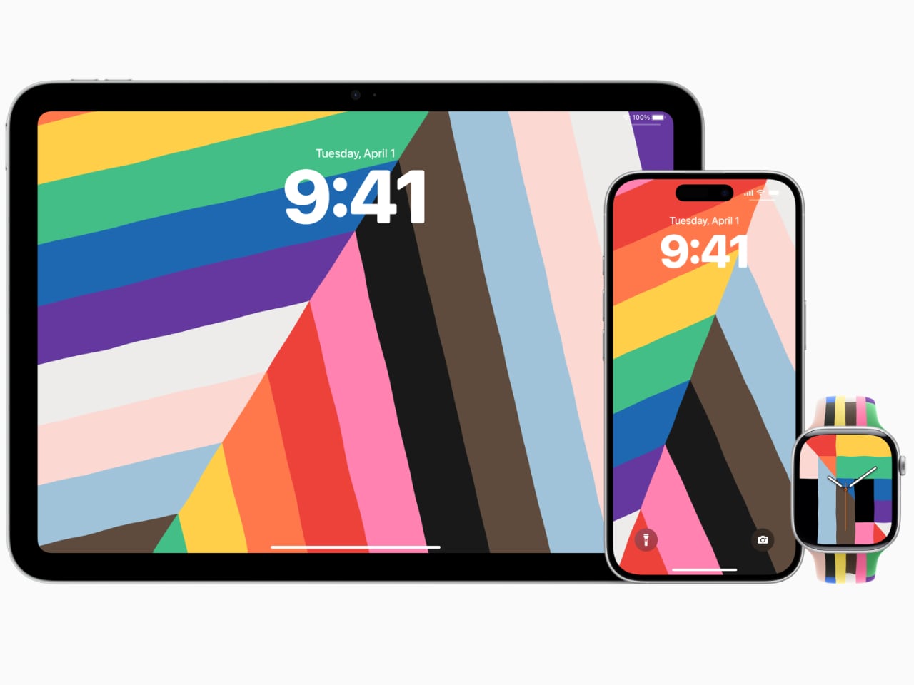
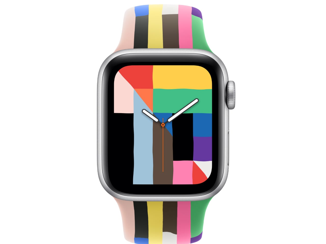
As the day moves, so does the watch face. Apple’s updated Pride face pulls the palette into motion. When idle, it stays minimal. But as the screen wakes, bright colors animate into large numerals that feel closer to kinetic art than graphic design. This avoids the feel of a novelty animation. It repeats every time the screen is raised, blending utility with personality without pulling attention away from timekeeping.
The Pride Edition’s visual design invites recognition. Its multicolor layout and clean geometry are immediately noticeable, often prompting curiosity. For those familiar with the collection’s background, it functions as a visible reference to identity, inclusion, and cultural support. The design remains quiet in tone while being clear in purpose.
Apple’s Pride efforts have become an annual release cycle, but this one stands apart in how it treats materials and motion as the primary storytelling tools. It doesn’t rely on text. There’s no flag printed on the band. There’s no commemorative engraving. Instead, it relies on form, hue, and tech layering across devices. On an iPhone, the matching wallpaper stretches the gradient into something more abstract. On an iPad, it scales without losing the rhythm.
The Pride Edition maintains the characteristics expected from Apple’s sport bands. It is sweatproof, durable, and lightweight. Integrating visual identity into daily-use hardware allows it to operate as both a practical tool and a visual expression. In some environments, it may resonate more as a signal of support or recognition.
That duality is where the collection fits. Several brands engage with Pride. Apple approaches it through a combination of physical craft and interface design. The watch band, face, and wallpapers act as extensions of each other, not in a way that demands full matching, but in a way that mirrors how people move through spaces with tech always at hand.
This year’s release is available in time for Pride Month, and it carries no specific date attachment. It functions year-round. Whether it shows up in meetings, on crosswalks, or next to someone’s daily reminders, it keeps presence visible without forcing the conversation.
That’s part of the evolution of modern accessories. These pieces integrate with the tools people use. They shape how identity and function coexist. Well-executed design does more than mirror culture. It helps solidify it.