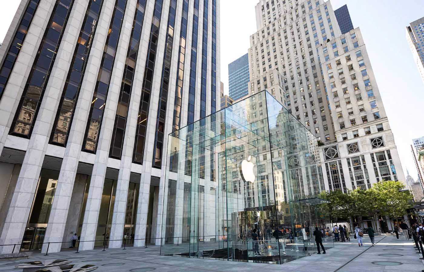
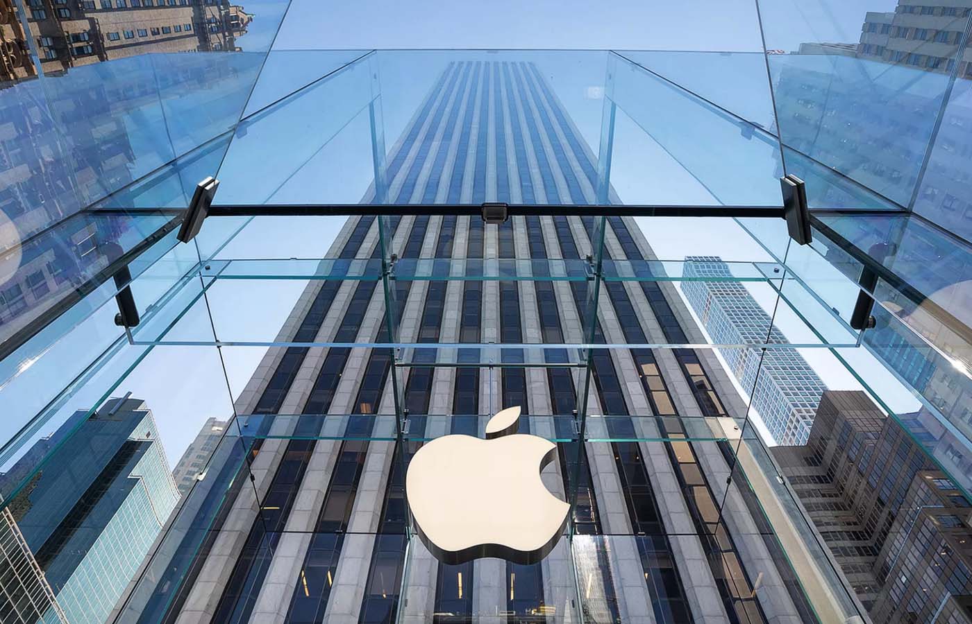
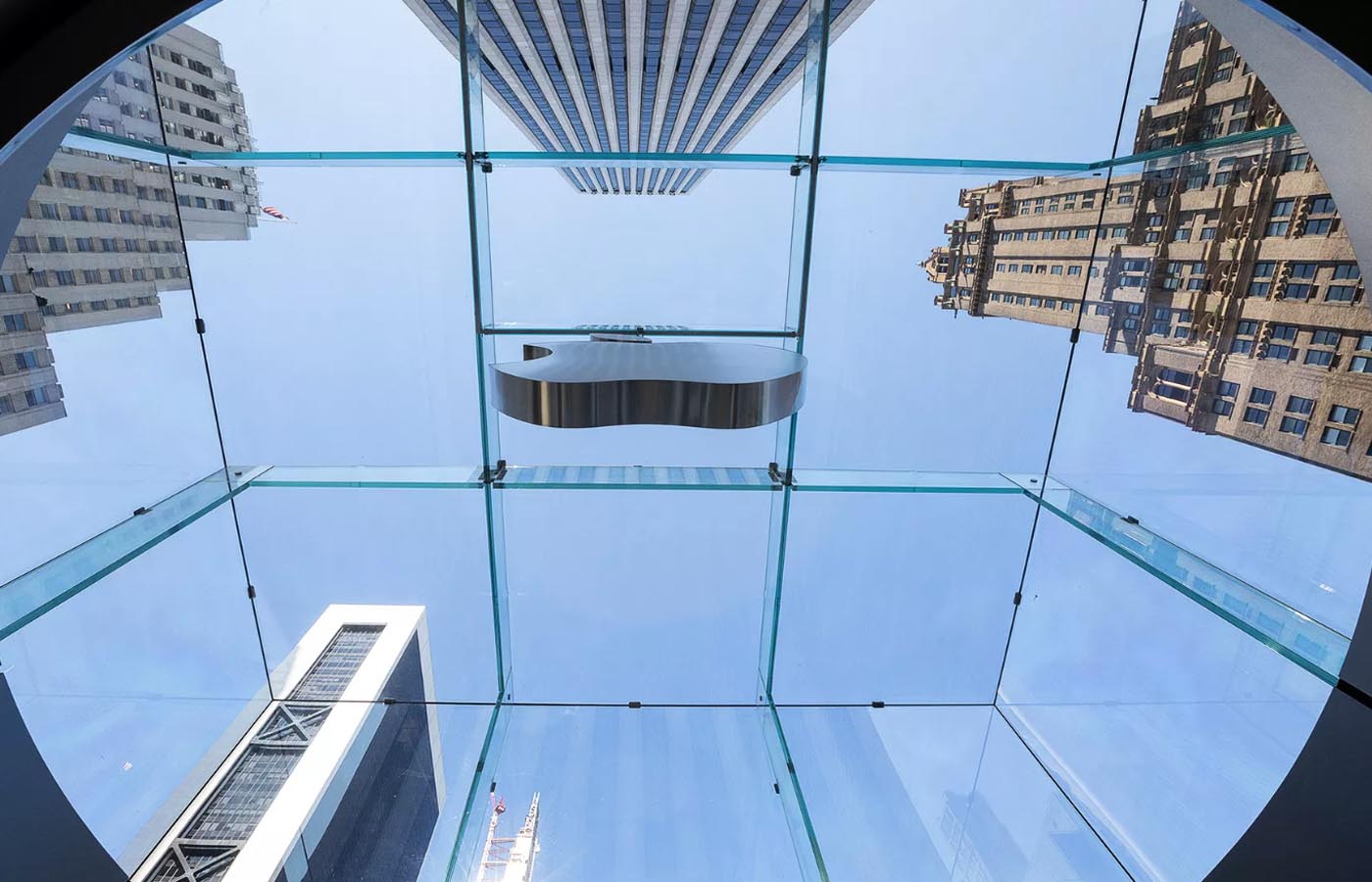
Take a look at the outside and inside of the redesigned iconic landmark
Apple’s iconic flagship store got a very extensive makeover and recently opened to the public. The launch of the renovated cube store was coupled up with the debut of the new iPhone 11 and iPhone 11 Pro. The cube had been closed since 2017, but is now open for business again. The store has a completely new feel, yet holds on to the classic Apple shopping experience.
People come to New York City from around the world and include the Apple cube on their sightseeing itinerary. More than 57 million visitors have gone to see it since the original opening of the store. And Apple expects a whole lot more to come.
Here are some of the new things to look for and some of the things you can continue to expect. The process is still a familiar one, but the new space on Fifth Avenue is refreshingly larger, more grandiose and pleasant than ever before. Perhaps, some people would like to have seen even more surprise changes in the retail landmark’s design, but the new design is neat and cool. Thus, the detail is worth taking a look at in depth. So, let’s tour the new Apple cube in NYC.
The new exterior of the cube
Starting with the outside of the structure. If you remember, the big glass cube was stand alone and surrounded by New York City skyscrapers. Well, the new area is now a definitively more friendly one with the space around the cube having been turned into a public plaza – a delightful area where people can linger, hang out, and enjoy surrounding adjacent sights like Central Park and The Plaza Hotel. If you need more incentive to pass by, then you can take advantage of the free WiFi Apple broadcasts there.
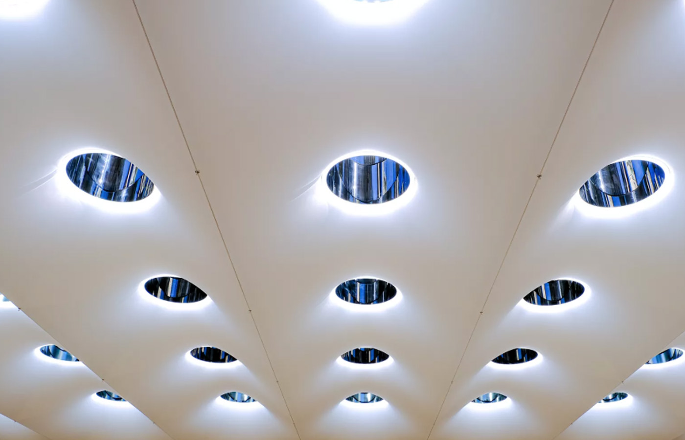
Apple’s intention for reworking the entire store is that they want to “resume its place at the heart of one of the world’s most vibrant creative communities”. You’ll also now find in the plaza around the cube, sixty-two circular skylights. These frosted skylights allow natural light to beam down into the store below.
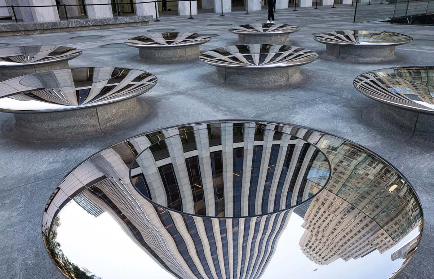
Eighteen metallic seats have been set on either side of the cube, which Apple refers to as “sky lenses” –these shiny objects give people the ability to look down into the store and see what’s going on. They are also obviously a place for you to sit and relax.
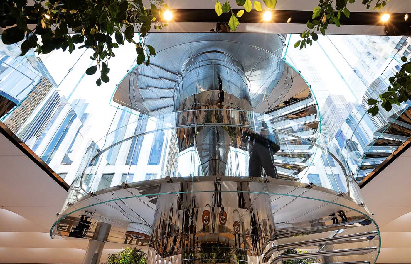
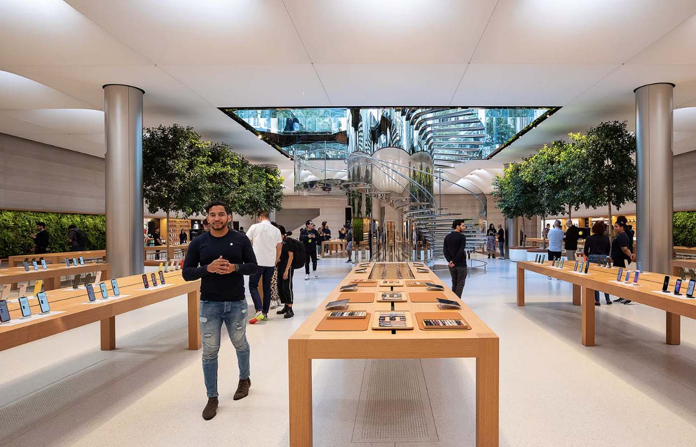
The previous Apple cube store only had one entrance – a grand spiral stairwell made of glass – forcing everybody through one point of entry. However, Apple decided to add an additional entrance to this new iteration of the store. People now have the option to go down come down via elevator, should they so choose. But, as Apple entrance’s have always made a grand statement, it’s likely that most tourists will still prefer enter using the main entrance. The new staircase is made of a really shiny stainless steel which helps to reflect light from the outside and mirror the space inside.
New interior of the store
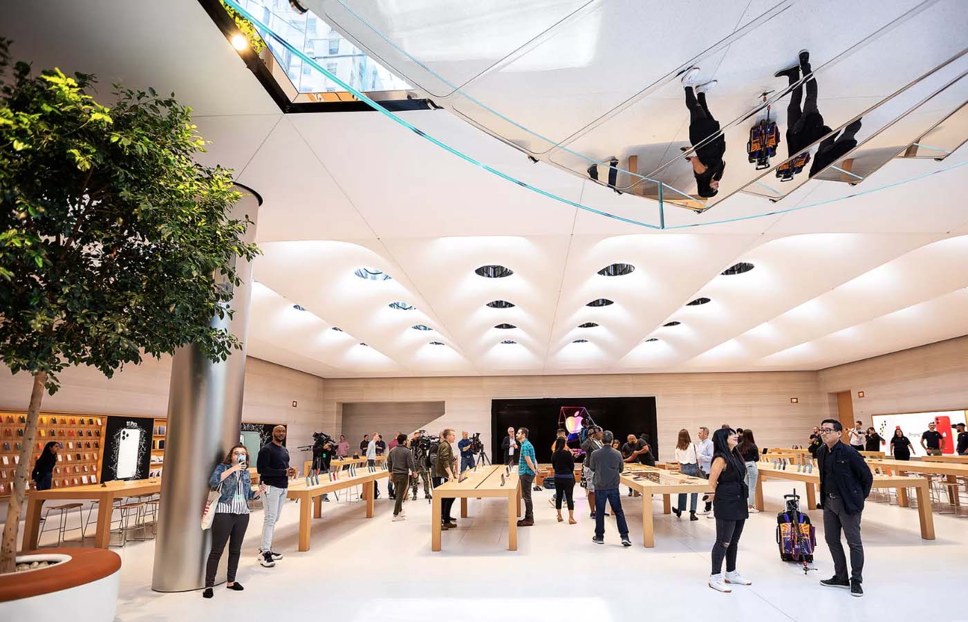
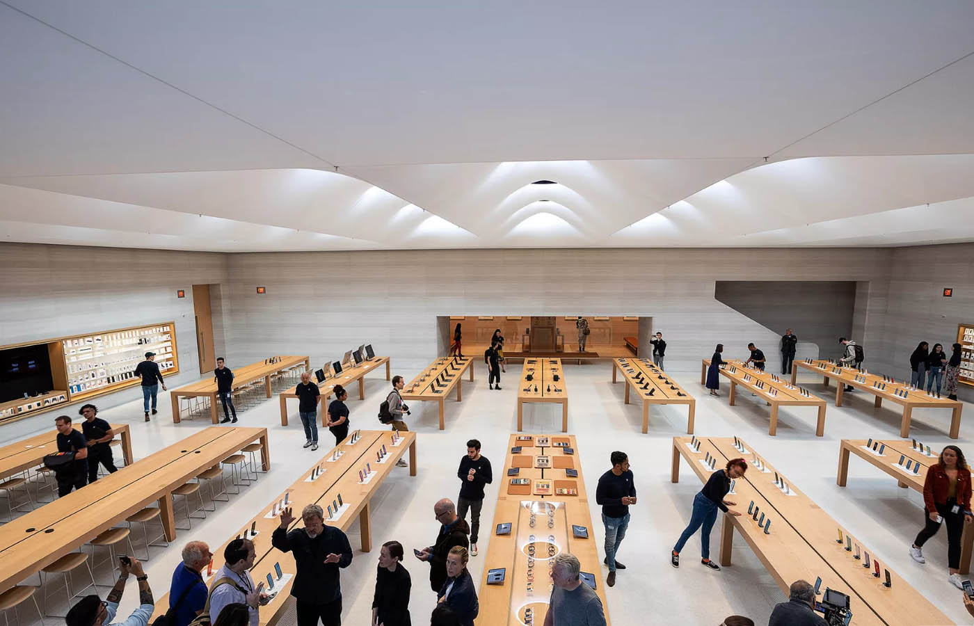
Descending the stainless-steel stairs into the beautiful bowels of the reconfigured shopping space, you’ll remark that the store is about twice as large as the previous one. With incredibly lofty ceilings for a bright, open, and airy feeling, you’ll feel like a fairy on a shopping spree – only your wallet will be the magic wand.
The underground part of the store was completely razed and considered from a blank slate in tandem with the architecture firm Foster and Partners. And, it’s clear that Apple spared no expense. Walking around the inside, the 62 skylights from above give the super high ceilings a uniquely upholstered and quilted look. The natural light that comes through these portals and into the store help to blend the outside with the inside and create a more natural atmosphere – and one that is less artificial.
Sunlight, LEDs, and plants for a natural feel
In addition to all the natural light pouring into the interior, adjustable LEDs have been added to the ceilings and shift between warm and cool hues throughout the course of a day to enhance an organic feeling, eschewing an artificial one.
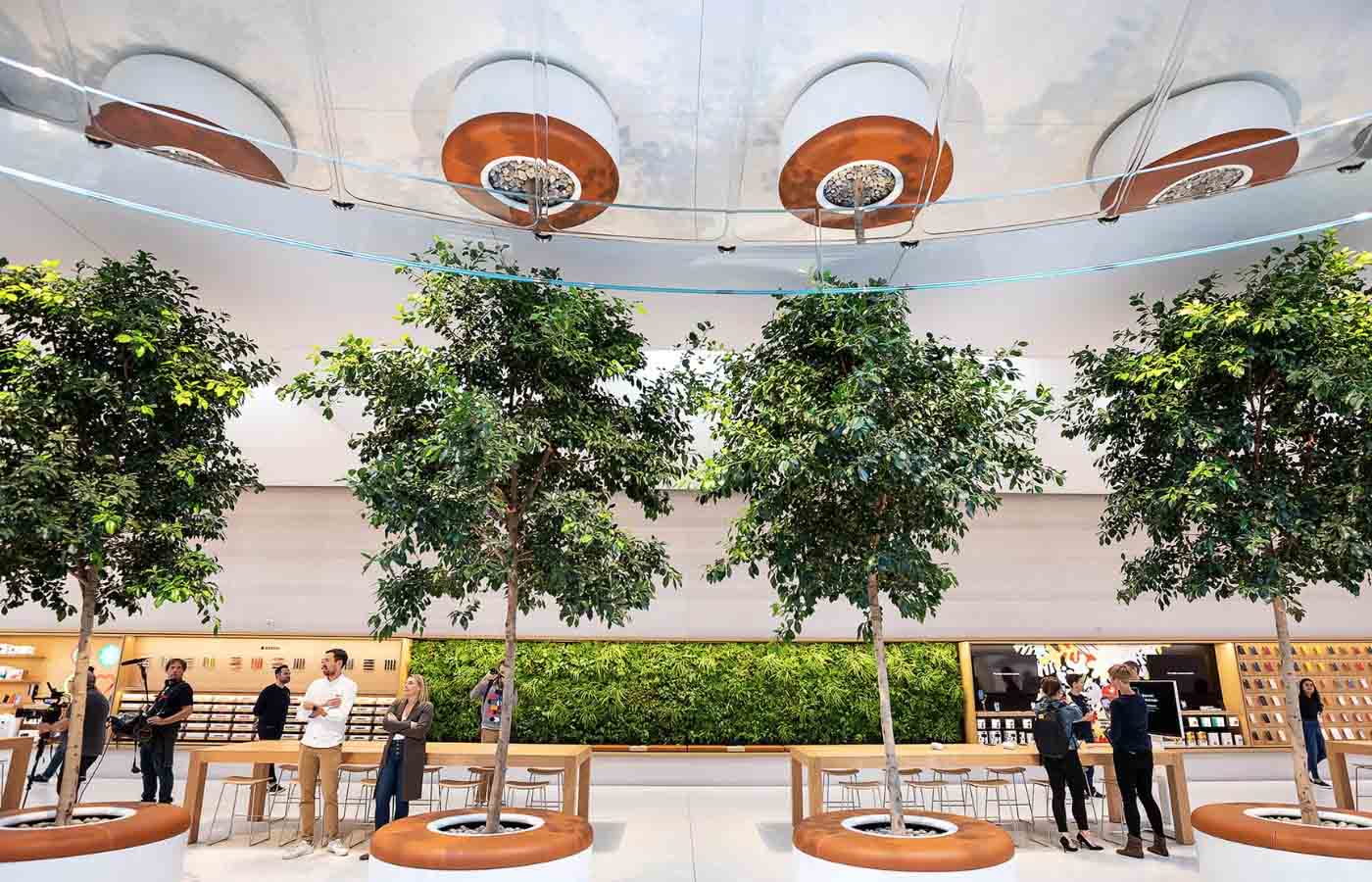
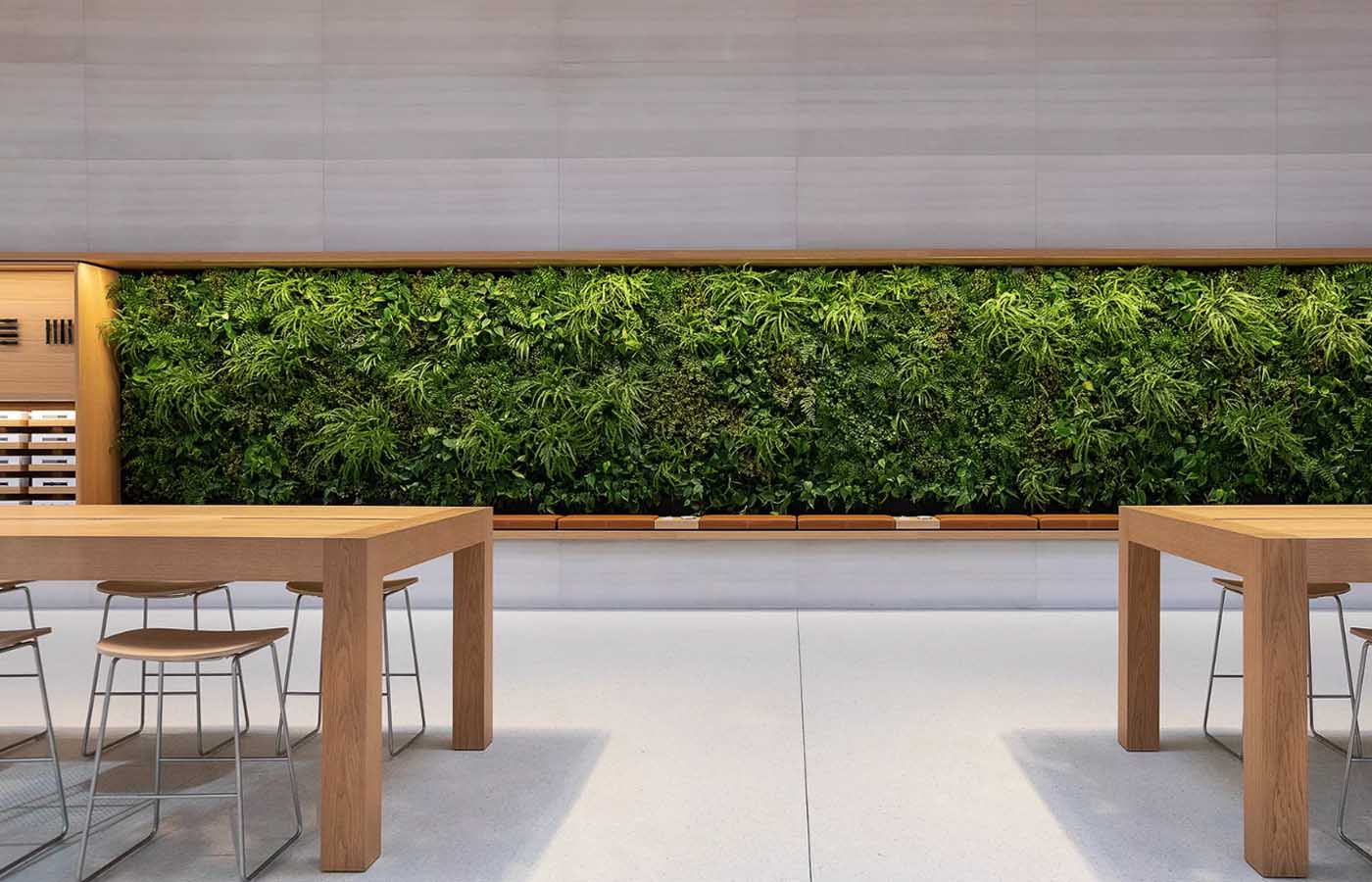
The furniture and design elements used to display the products are very minimalist and the store still has a community space vibe to it. You’ll also notice that Apple has placed plenty of living trees and greenwall – something they started doing back in 2016 in trying to achieve the ultimate tech farmer’s market – of course one that’s also very modern and futuristic in appearance.
A few additional words about the Apple shopping experience at the new cube
The design has changed, but the Apple retail experience pretty much remains the same it was before. The re-opening of Apple’s cube in NYC doesn’t mark the beginning of new era of Apple retail. Rather, it’s all about the reorganization of space and eye-catching style and design.
You’ll find that the guts of the Apple retail experience remain intact and the same as before – whether that’s a good thing or a bad thing is for you to decide. For example, there is still no line necessary in order to check out and the Genius Bar process hasn’t changed in anyway. You’ll need to track down an employee with a portable checkout iPod Touches or use the Apple Store app for a self-checkout for that.
The new cube doesn’t address things like Apples operation or try to tackle any customer satisfaction issues. But these things will probably be better at the cube due to a couple of key reasons: there are now roughly 900 employees dedicated making the store run smoothly (as opposed to only 300 before), the fact that it’s inarguably a nice place to spend time, and an expanded Genius Bar.
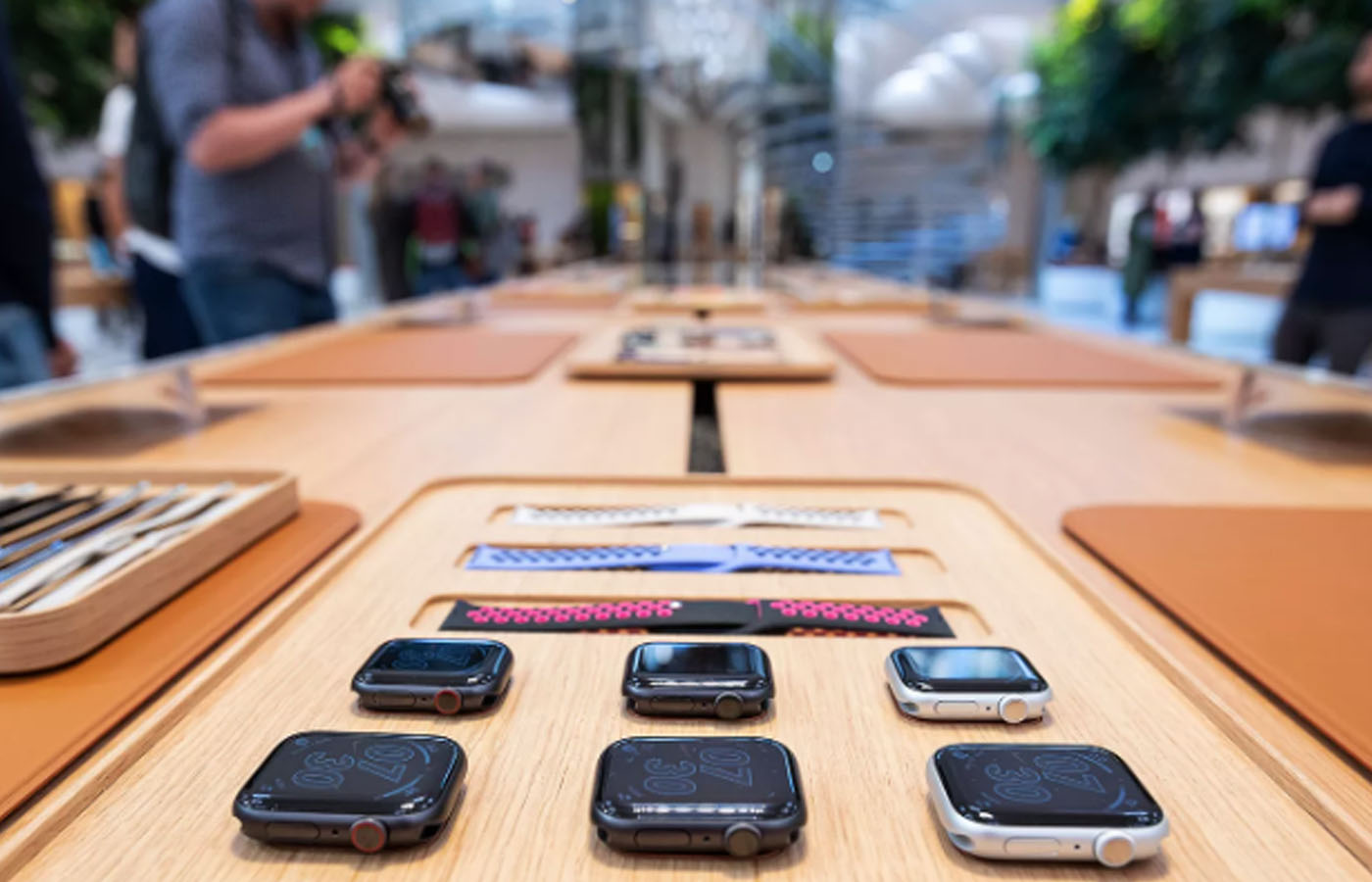
The space also incorporates more room for Apple classes and presentations, and new Apple Watch Studio, or close to an exact copy of it, is located in the store – where customers can create an ideal and bespoke Apple watch design with preferred size, case material, and band – and purchase it in the box. As well as a room for people to play with the HomePod.

