Apple just dropped iOS 26 Beta 2, and if you tried the first beta and found yourself squinting at Control Center trying to figure out which button was which, you’re not alone. Apple heard you loud and clear, and they’ve already started fixing the most glaring issue with their new Liquid Glass design. The company’s quick response shows they’re taking user feedback seriously, especially when it comes to basic functionality that millions of people use every day.
When iOS 26 Beta 1 launched with Apple’s flashy new Liquid Glass interface, it looked undeniably cool. The transparent, frosted-glass aesthetic gave iOS a fresh, modern vibe that felt like something straight out of a sci-fi movie. But there was one massive problem: you couldn’t use it properly.
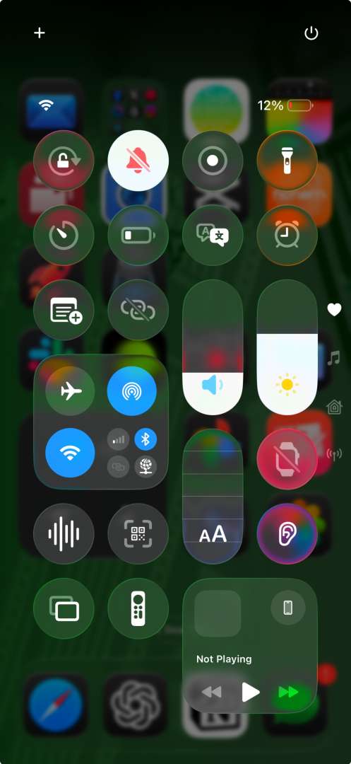
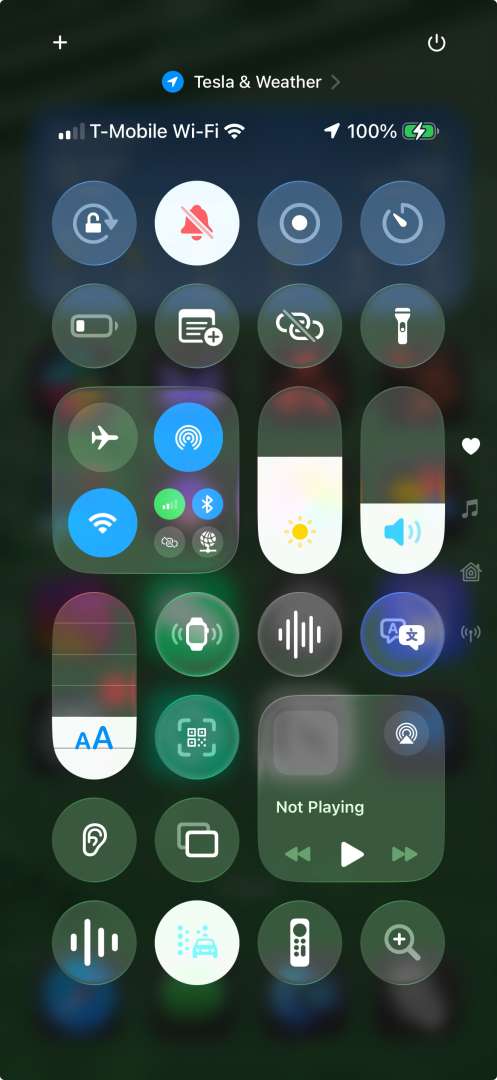
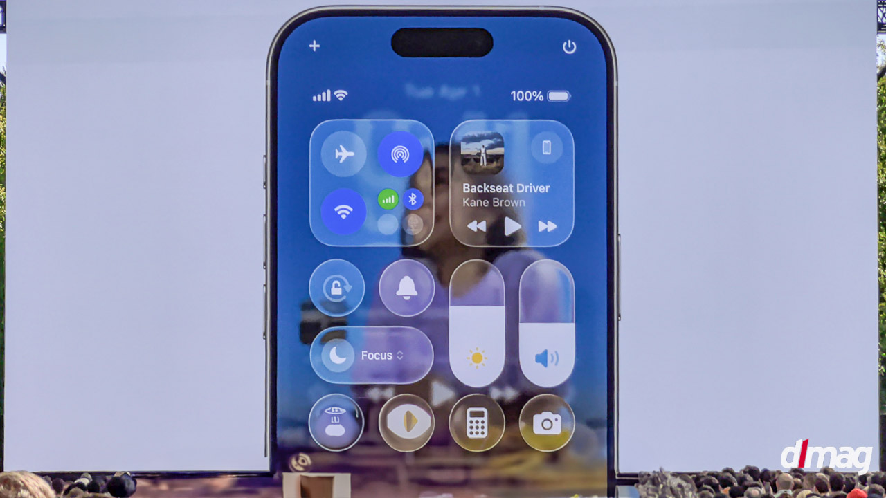
Control Center became a frustrating guessing game where the semi-transparent overlay made it nearly impossible to distinguish between actual controls and whatever was happening on your home screen underneath. Trying to adjust brightness or toggle Wi-Fi over a colorful wallpaper? Good luck with that. Users found themselves tapping blindly, hoping they’d hit the right button while their wallpaper created visual chaos behind the interface. The beautiful design was getting in the way of basic tasks that should be second nature.
The new beta addresses this headache with surgical precision. First, Apple cranked up the background blur behind Control Center, so your home screen icons don’t bleed through and confuse everything. Second, they made the control buttons themselves more opaque without killing the glass effect entirely. The difference is immediately noticeable – controls now have proper contrast against busy backgrounds, and you can actually read labels and see button states without having to guess.
Control Center wasn’t the only casualty of the Liquid Glass experiment. Notifications on the lock screen struggled with readability, especially over bright wallpaper backgrounds, creating similar frustrations for users trying to quickly scan their messages and alerts.
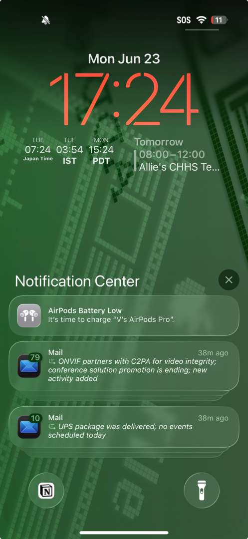
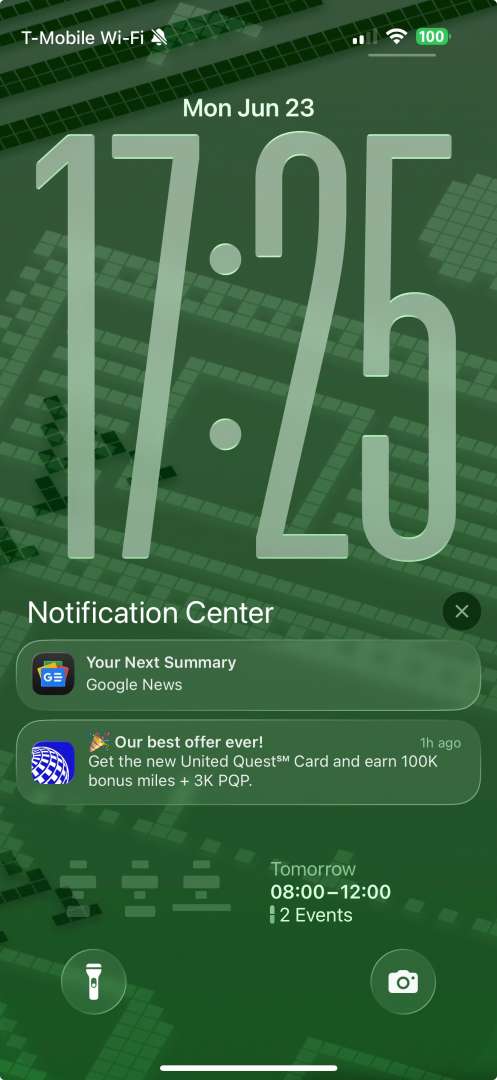
Apple made improvements here too, though they’re more subtle. The notification text gained sharpness, but certain backgrounds still pose challenges. The quick fixes in Beta 2 demonstrate Apple’s commitment to real-world usability feedback from developers and beta testers. With several more beta cycles before the fall release, users can expect continued refinements as Apple balances visual appeal with practical functionality. The company has ambitious plans for this design language across iPhone, iPad, Mac, and Apple TV, making these foundational improvements crucial for the broader rollout.
Beta 2 represents Apple finding that sweet spot between form and function. The glass effect remains intact, still modern and fresh, but now it serves users instead of hindering them. Sometimes the most important updates aren’t the flashy new features that get keynote time – they’re the tweaks that make everyday interactions work smoothly again.