Type is everywhere and it’s something most of us take for granted. We use it on a daily basis: looking at a street sign while trying to navigate or even reading this very article online. All of the letters our eyes peruse over haven’t just been slapped onto a blank page with little regard for thought. On the contrary, every letter of each typeface has been carefully crafted and curated to evoke an emotion out of a reader and create a reading experience; a font communicates on multiple levels with a reader.
You might be wondering about the terminology and difference between words like typography, font, and typeface. Typography is the artistic process of creating the letters we use every day – the steps from concept to actually getting them into the public domain for use. A font is a collection of letters with different weights, point sizes, bold and italics. Fonts don’t only consist of letters but also include things like numbers and punctuation marks. Typeface is the family or ‘overall look and feel’ of a font, in other words, the design.
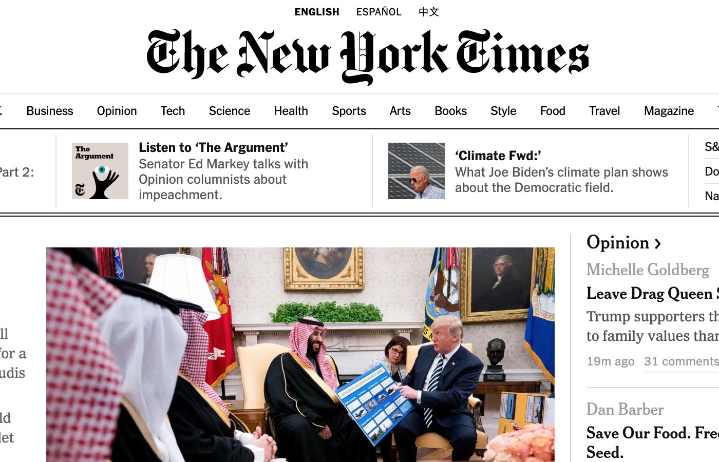
Up until the fifteenth century, when the first printing press was developed by Johannes Gutenberg, most things were written down by hand. Every book was essentially a work of art being rare, valuable, and expensive. Gutenberg created the first typeface, called Blackletter (also referred to as Gothic script or Old English). Blackletter was used early on in manuscript lettering and is still used in many applications of modern times. Blackletter has a heavy, medieval look and rather difficult to read. In fact, The New York Times logo has been created with this font – harking back to the origins of printing and mass communication no doubt.
The beginning of the sixteenth century brought the rise of Italics. Italics were originally created as a way to squeeze more words onto a page, thereby saving a printer sizable sums of money on ink and paper in the process.
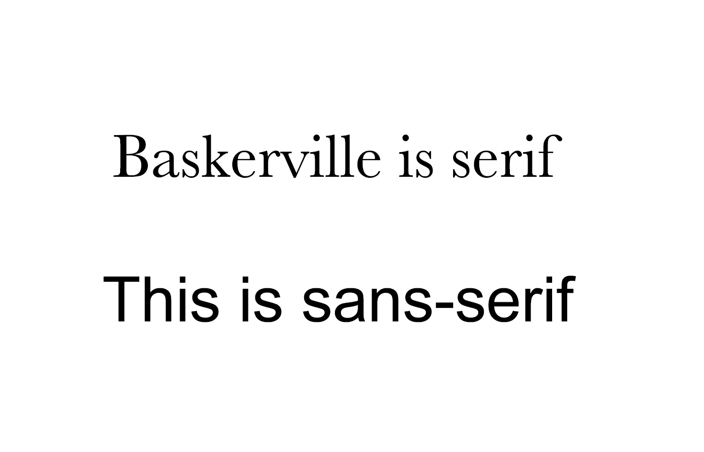
The first Roman-style type was created by the John Baskerville during the course of the eighteenth century – hence, the Baskerville font. It’s more than likely that you’ve seen and have used these fonts in word processing software. A number of updates were made to serif collections until the nineteenth century, when suddenly, along came the sans-serif. Font collection designs multiplied exponentially and took off with advertising. The difference between a serif and sans-serif font is referred to as the “feet” – the decorative and ornamental finishing at the end of each letter. Below is an example.
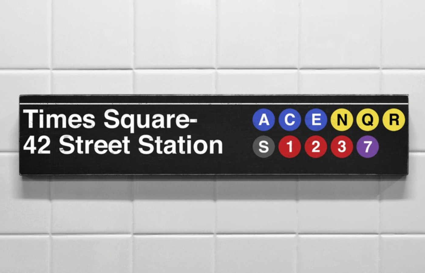
In 1957, Swiss designer, Max Miedinger created the world’s most used font (although he didn’t know it at the time), called Helvetica. Helvetica is sans-serif with clean, bold lines and modern look. It is a ubiquitous font that’s used on many things we are familiar with today: from the New York City subway system to the logo of American Airlines.
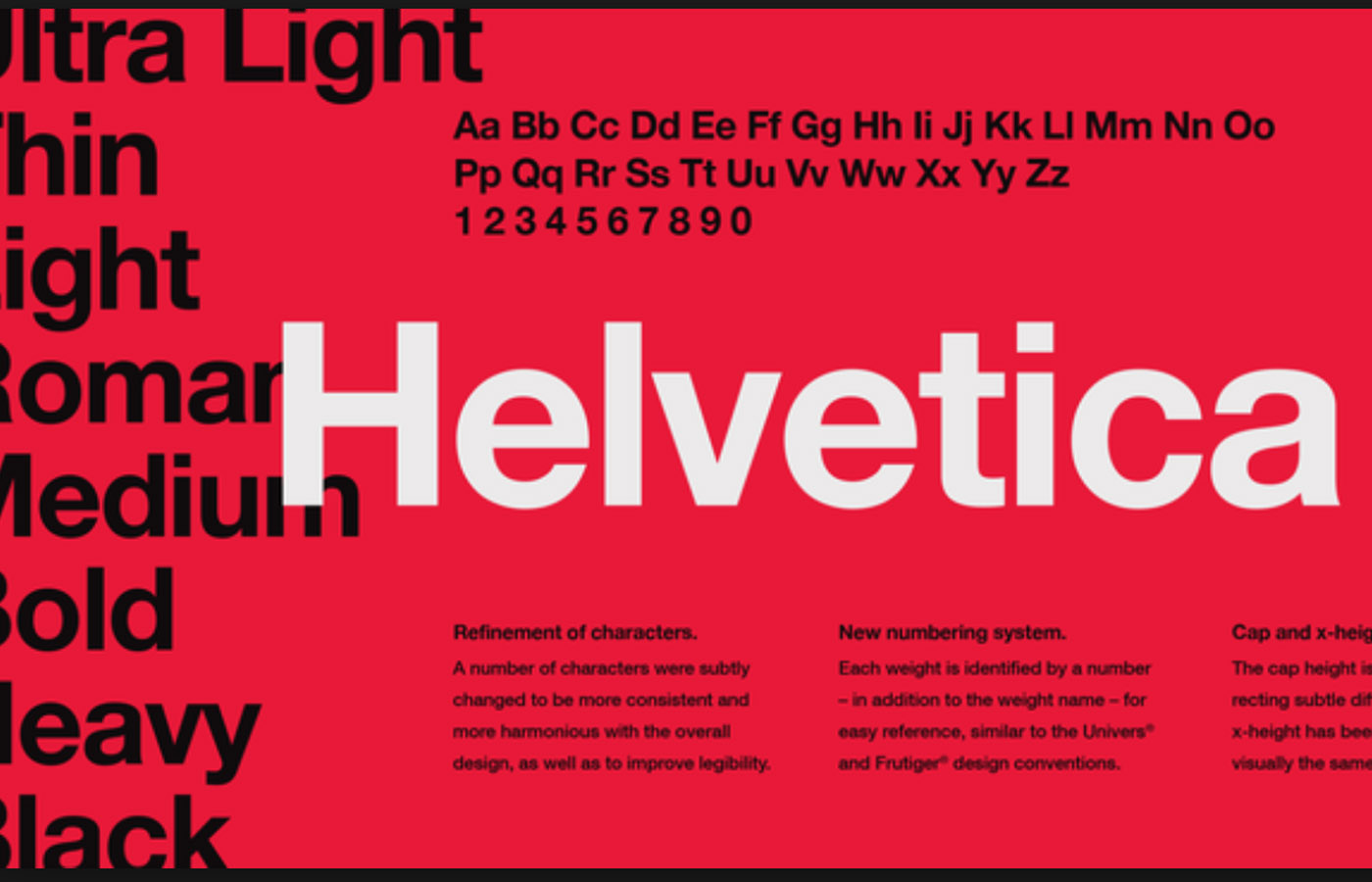

Fonts should be thought of like architecture; they either have good design and construction, or not. A well-made font like Helvetica should have a very long shelf life; it will not fall out of fashion or use in a short amount of time. Companies like Google, Apple, and IBM used the Helvetica font until a few years ago, when they started to feel it outdating.

Charles Nix is the director of the type company Monotype – a font and technology company that commissioned many of the most recognizable fonts out there today, like Gill Sans and Times New Roman. The company owns the licensing rights to Helvetica. Nix had some gripes about the Helvetica font design, so he forged ahead and created a fresh and updated, pretty much new version of the font known as Helvetica Now which debuted in 2019. It was a process to say the least as reworking the lettering took around two years. The hope is to make people fall in love, all over again, with the iconic typeface.
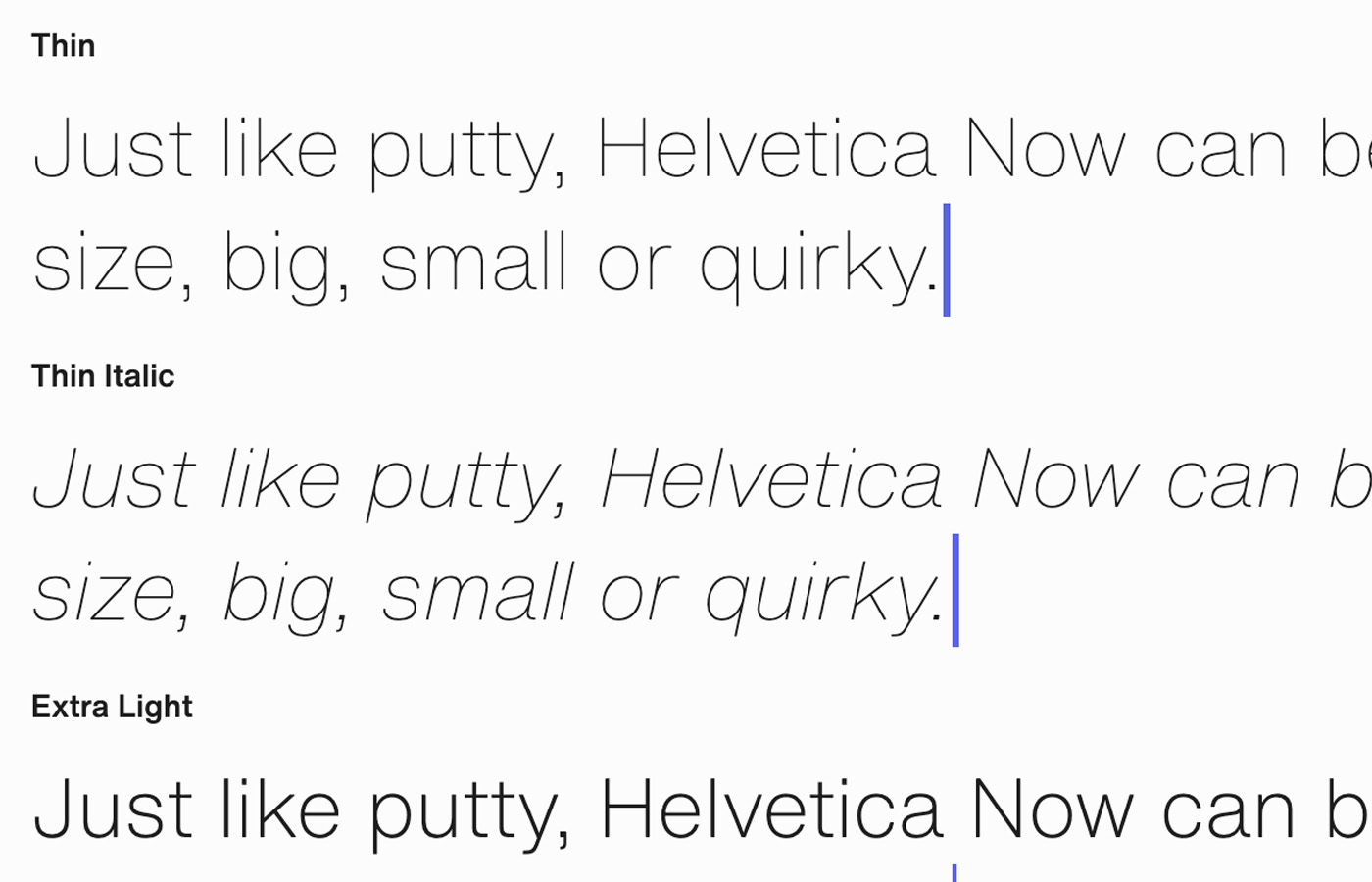
Helvetica Now has been created to meet the demands of today. According to Monotype, “every character in Helvetica Now has been redrawn and refit; with a variety of useful alternates added … [with] everything we love about Helvetica and everything we need for typography today.”